A couple of years ago, a client came to us for help to understand the ‘digital maturity of their practices and PCNs’, asking us which indicators we would use to measure a baseline and monitor improvements, and then take practices through different levels of maturity. What a lovely question – we had a ponder in the team.
What was the problem they were trying to solve?
Well,
- They knew they could access various digital data sets, but they couldn’t see a way to compare across practices, within PCNs, Boroughs or across the ICB.
- They had to look in lots of different places to find data but couldn’t decide which elements would help.
- Some data was open source but updated annually or with a time delay in release, so aligning and getting a baseline was challenging.
- Some data didn’t seem to be relevant, but they weren’t sure if it was or not because they weren’t close enough to the service delivery to know if and how it helped.
- Other data was behind barriers to access; usernames, logins, assigned to specific roles, and some data was provided to them directly by system suppliers.
- They had programmes to deliver; online and video consulting, improve GP websites, advanced telephony.
- They wanted to help their practices to mature, but didn’t know what ‘mature’ looked like.
- They wanted to use data to underpin and evidence any improvement.
No small ask. My biggest fear was that anything we provided would be used to ‘performance manage’ practices who might appear at the ‘lower end of any scale’, without any understanding the complexity of primary care and running the risk of focussing on one dataset, in isolation of the others.

I’ve been on the receiving end of a ‘Red, Amber, Green rating’, and been given stretch targets in previous roles. Benchmarking can be a challenge and cause unintended consequences, if not communicated and managed well. It can be tough when working in one of the ‘top performing’ practices, then being compared against others who were given much less to ‘achieve’. I was very keen to stress that, yes, we could offer help, but the data we collated would come with a health warning about its purpose and use.
Roll on 2 years…..
We have moved through a process of days of data mining and cleansing via databases and working with multiple spreadsheet and worksheet merges. We’ve had people try and make it an easier process. We’ve seen the NHS develop further data sets and stop supplying some that were useful. We binned the idea of ‘levels of maturity’ as the improvements can fluctuate and its soul destroying to drop a level when working flat out. We have moved on to think more about how we visualise the baseline and show progress, whilst trying to make it as user friendly as possible, and finally, with the super team at Primary Care Analytics, ‘we’ve built a thing’ that people seem to be enthused by.
How Redmoor Health add value
This is the real gem for me. It’s not just about looking at the numbers, trends, or patterns, it’s about understanding the environment, each activity and then connecting the various datasets to tell the story for the people who are currently so overwhelmed with data and requests for how they can use it, they cannot see beyond the spreadsheets. We’ve had this experience this last few weeks, as a number of our clients are submitting their capacity and access improvement plans. Seeing the ICB variability of requests for plans, some helpfully pre-populated, others just big horrible spreadsheets, makes me weep.
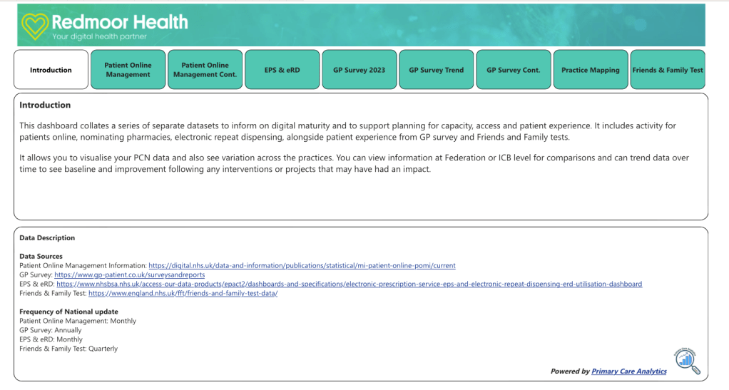
Our team of primary care specialists can quickly look at the various elements in the Digital Maturity Index (DMI for short – because we love a three-letter acronym in the NHS) and walk you through:
How many people are enabled for Online Services? Average of 49% nationally
How many people are using online services each month? Average of 1.3% nationally for appointments.
How many people can order their medication online, then how many are doing this? Average of 49% are enabled, but only 12% ordering each month, in some areas its less than 1%.
The missed opportunity suddenly jumps out!
Many patients are keen to do things online, they understand how to do this, and want to help their practices by self serving. Some may have the NHS App, downloaded during Covid but are not utilising it to do even the most basic of transactions. Some have had a poor experience and dont use again. So, we can dig and ask why. It’s easy to spot those practices who aren’t offering online appointment booking and cancelling – but we take this a step further. We offer help with searches so they can see who has booked into the wrong slot – Yes, we all know about the patient who has booked their Asthma review online, but they’ve booked into a ‘smear’ slot. Practices may also be using a system that doesn’t feed into the ‘patient online’ data, that doesn’t mean they aren’t offering online booking. We coach and support ICBs to understand and check this, before making assumptions about performance.
We also help practices and PCNs to see where they may be creating some of their own demand and advise how to reduce this.
From a patient experience lens, we can view Friends and Family test data and GP Patient Survey data. We can look to compare patient experience and see the Telephony demand, lo and behold, 84% of calls are about appointments. We’ve already established that utilisation is low, compared to the patients ability to do this. We know how to help avoid the 8am rush and its not just about having cloud based telephony, its about call flow design, relationships with online services and good signposting to alternatives.
We have included electronic prescribing and repeat dispensing data, then we can compare pharmacy nomination and repeat dispensing to check that practices are taking advantage of these options to reduce workload demand.
We can look at the question: ‘how easy did the patient find the GP website to use’. If the website hasn’t got the right information about how to do things, it’s not a surprise that telephone demand is high. We can even see which services were used when the practice is closed, with 57% using NHS 111 nationally.
Already some of our clients are asking for extra data sets to be included, so we’ve added the Register with a GP Surgery data and the GP2GP data too.
Finally, we can look at how the practices in each PCN compare on a map and see patient satisfaction across a range of 8 questions, not just the 4 recommended in the latest Capacity and Access improvement plan requirements.
Not only does the DMI help us and our clients to see the opportunity, but it is also helps us to see the improvement of the practices using the Digital Journey Planner, our step by step coaching and knowledge system in use in over 1300 practices in England.
We are delighted to announce our Partnership with Conor Price and the team at Primary Care Analytics to use primary care data to inform our work and see where we can offer help.
If you’d like a walk through, please do get in touch hello@redmoorhealth.co.uk
